Right cosmetics
시각 장애인과 비장애인 모두를 위한 화장품 브랜드
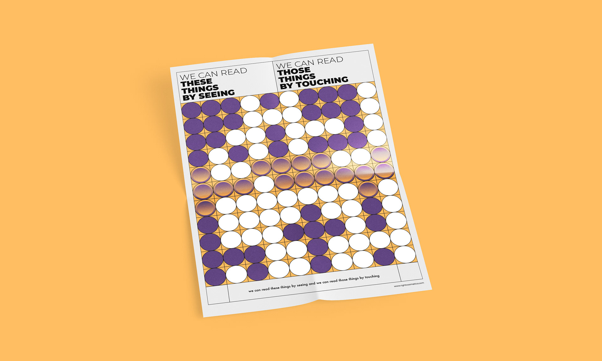
시각장애인의 언어가 적용된 화장품은 소수이고 그마저도 점자에 한정되어 있습니다. 시각장애인의 점자의 해독률이 약 5.2%로 매우 낮음에도 점자에만 치중되어 있다는 것은 그만큼 시각장애인에 대한 사회의 관심이 부족하고 연구가 덜 됐다는 것으로 볼 수 있었습니다.
그리하여 이들을 위해 점자 외 다양한 감각을 이용하여 제품을 구분할 수 있도록 하는 것에 초점을 맞췄습니다.
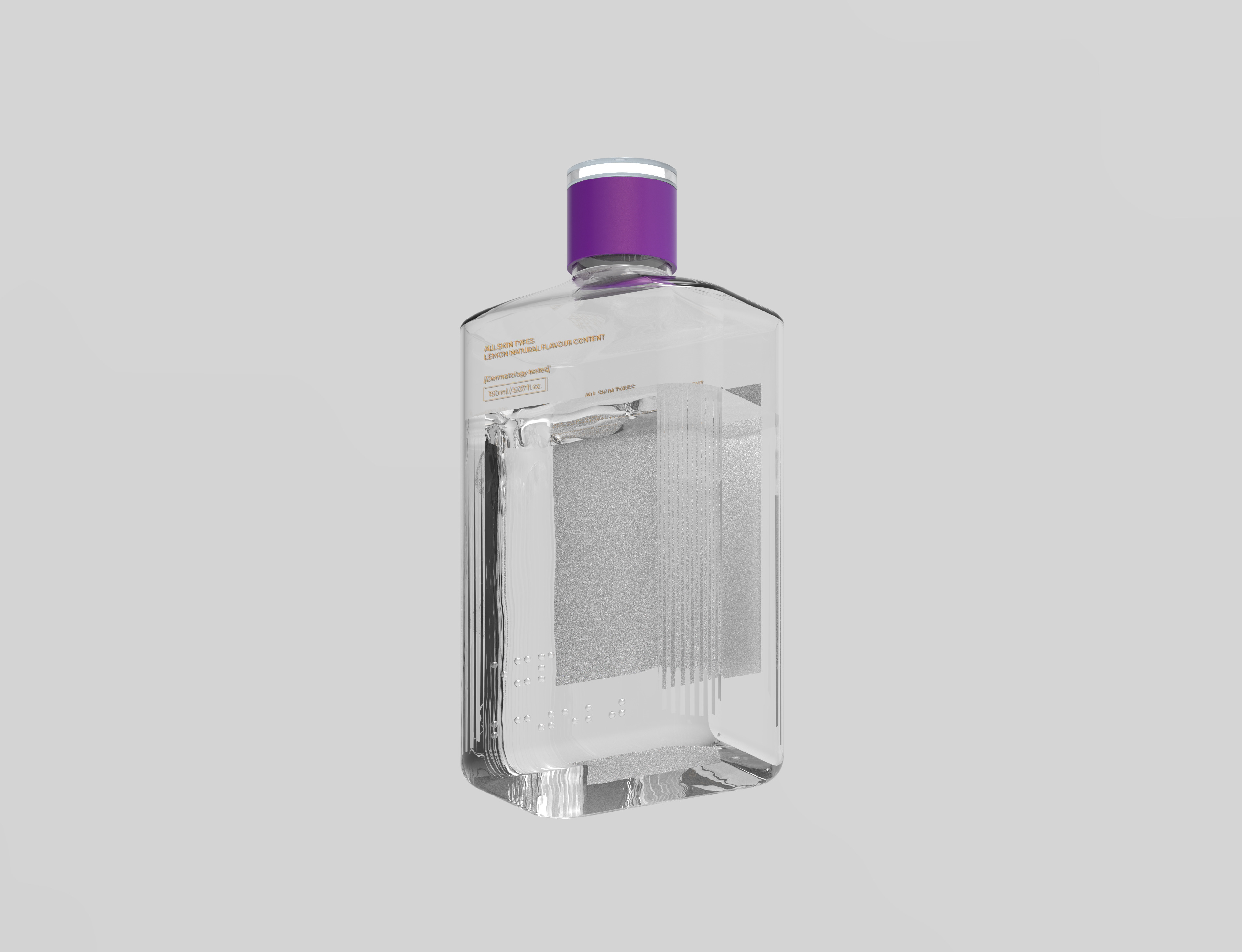
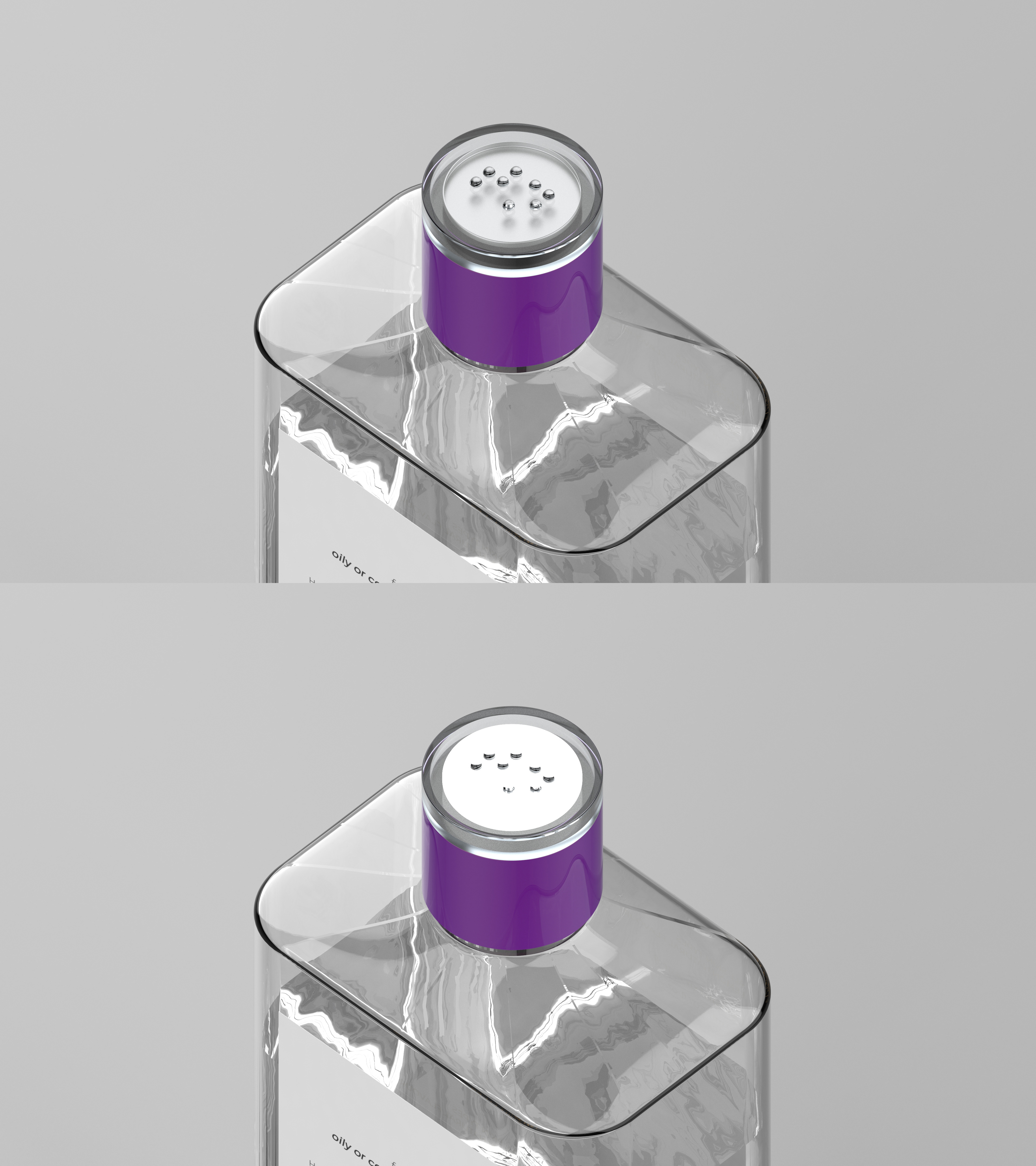
그리고 그 해답을 ‘빛’, ‘음성’, ‘뚜껑의 형태’, ‘향’ 에서 얻었습니다. 블랙과 골드, 화이트에 집중되어 있는 기존 화장품과 다르게 제품별로 뚜껑의 색상을 다르게 했고 메인 컬러는 사람들이 꺼리는 점자블록의 황색에서 영감을 받았습니다. 그 외에도 제품 사용 시 가장 먼저 손이 닿는 뚜껑의 형태를 각각 다르게 디자인하고 센서를 내장시켜 손이 닿으면 빛과 함께 제품에 대한 기본적인 설명이 음성으로 지원되도록 했습니다. 청각장애를 동반하는 경우를 대비하여 촉각과 후각을 모두 이용할 수 있도록 고안했습니다.
디자인. 임지예
Right cosmetics
Cosmetic brands for both the visually impaired and non-impaired
There are only a few cosmetics with the language of the blind, and even that is limited to braille. Although the decoding rate of Braille among the blind is very low at about 5.2%, the fact that it is focused only on Braille can be seen as a lack of social interest in the blind and less research.
So for them, we focused on making it possible to distinguish products using various senses other than braille.
And we got the answer from 'light', 'voice', 'form', 'scent'. Unlike conventional cosmetics, which are concentrated in black, gold, and white, the color of the cap is different for each product, and the main color is inspired by the yellow color of the braille block that people are reluctant to use. In addition, when using the product, the first shape of the cap to be touched was designed differently, and the sensor was built in so that when touched, the basic description of the product was supported by voice. It is designed to use both touch and smell in case of hearing impairment.
Design. Jee-ye Lim